
Colour gamut? What’s that you ask? A colour gamut, to put it in simple terms, is the entire spectrum of colour possible to display on a particular screen, produce on a particular printing device or capture by an input device, such as a scanner or camera. Bear in mind that when it comes to printing the gamut shape can be subject to different ink-paper combinations. ICC colour profiles describe colour gamuts.
2D vs 3D
Colour gamuts are usually represented in relation to an independent colour space such as Lab or XYZ.
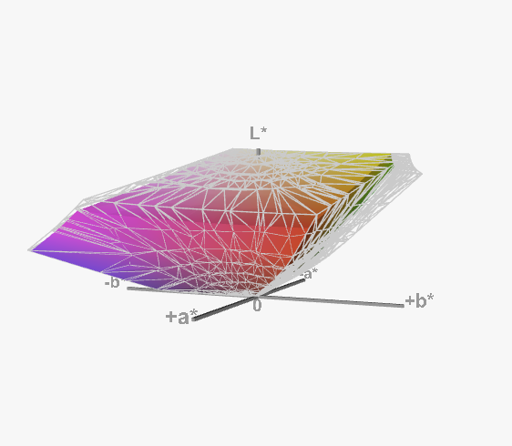
These colour spaces are both three dimensional, so to inspect, understand and compare colour gamuts it’s best to use a special 3D viewer software. You might have seen simplified flat 2D comparisons of gamuts like the one below. While this gives you a basic idea about the size of a gamut, it can be misleading.
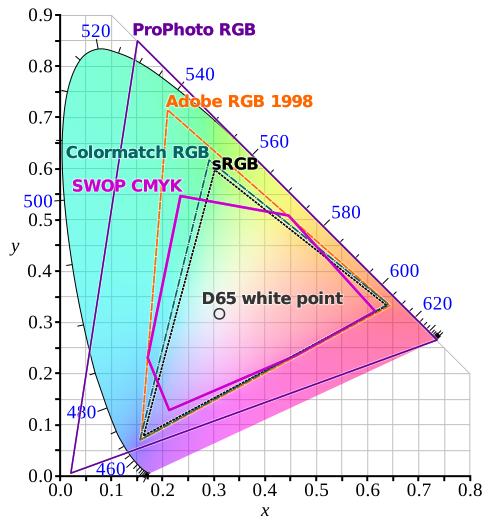
On the graph above, take note of the relation between SWOP CMYK and sRGB. You can clearly see that the sRGB doesn't contain the CMYK shape entirely. Some parts are sticking out, but because the colourful gradient in the back is just an approximation for illustratory purposes, it is difficult to gauge what colours are actually outside.
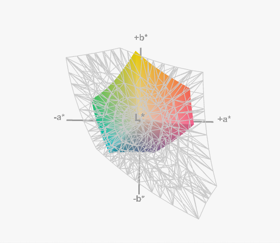
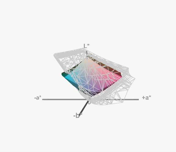
Now take a look at the two images below. What you're looking it is a depiction of two ICC profiles in the independent Lab colour space.
- US Web Coated (SWOP) v2 - the colourful solid shape
- sRGB - the light gray mesh
On the first, top down image you can see (behind the mesh) the 6 points of the CMYK shape. Starting from the top and going clock-wise, there's yellow, red, magenta, blue, cyan and green. After rotating the shapes around, one can clearly see that some of the most saturated cyans and greens aren't part of the sRGB gamut.
Concerns
If you are wondering what significance does this information have in practical terms, I can tell you about two things from the top of my head:
The RGB image (perhaps a logo?) you downloaded off of the internet (99% sRGB) after conversion to CMYK will have its cyans and greens dulled down. Some colour correction or other adjustment will be in order.
Your screen most likely isn't capable of displaying saturated cyans accurately. Most consumer display screens try to match the sRGB colour space. Apple's P3 Display is a bit better, but AdobeRGB(1998) is probably the best when it comes to working with print. High-end monitors boast 99% coverage of AdobeRGB.
Gamut warning
Some image editing software allow you to enable a so-called gamut warning. This feature highlights any part of the image that has colours that lie outside of the target gamut. It’s a very helpful tool to spot any potential issues early on in the process.
If you'd like me to go into more detail about colour gamuts, leave a comment below.
No Comments.