
- Logo design, pattern, print, layout & brand guidebook design - Karol Zagórski
- Art direction/Project lead, design and client communications - Przemek Fornal (todesign.pl)
In the begining of 2018, Przemek Fornal, owner of TO_DESIGN studio (todesign.pl) reached out to me to help with this branding project. A brand strategy and creative brief was prepared by a seperate company. The biggest constrain we had to face was the short deadline: one month. The other big challange was to please multiple decision-makers.
The meaning behind the logo
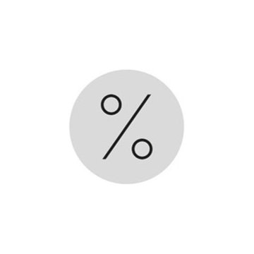
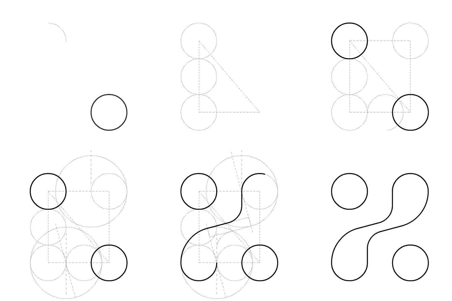
The main graphical motiff is a reference to the percent sign, which here symbolizes entrepreneurship and profit.
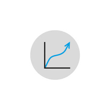
Diagonal direction bring to mind a rising line on a graph.
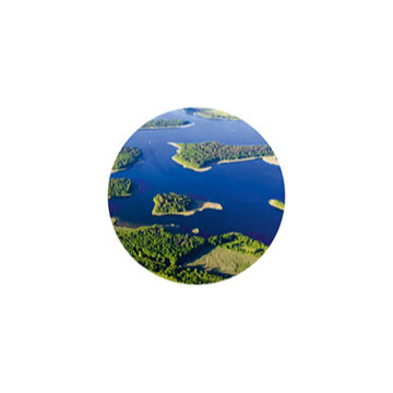
The rounded, middle shape represents the natural shape of Masurian lakes. The circles represent towns, cities and companies that lie in their vicinity.
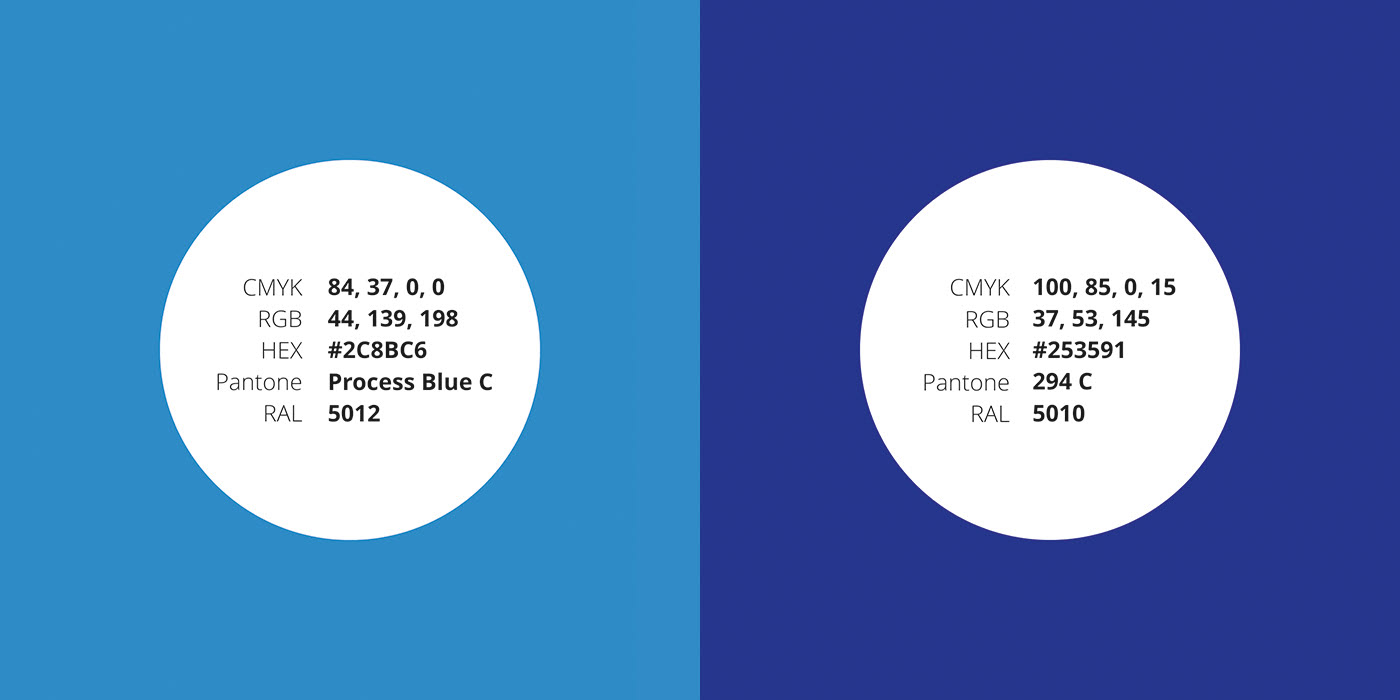
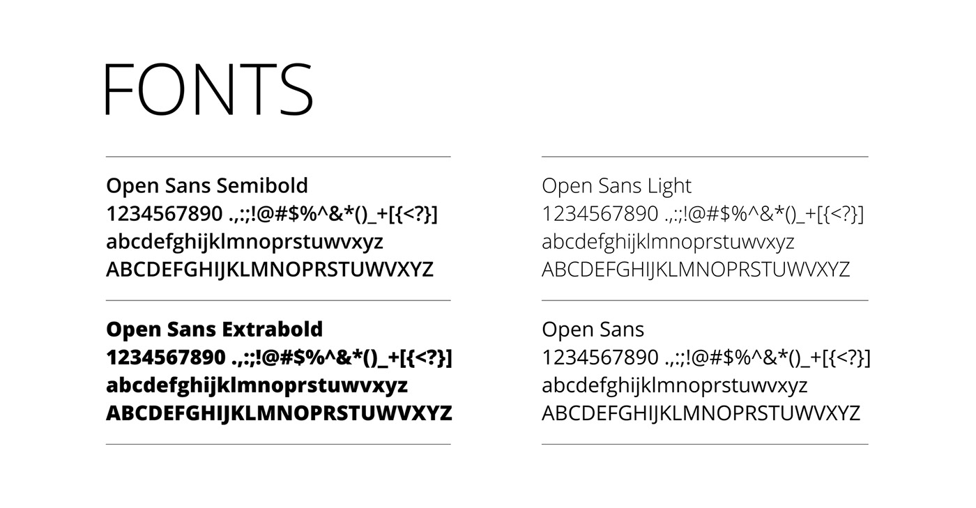
After the logo concept was approved we prepared an extensive brandbook that explains how to properly use the visual identity. It also included guidelines regarding preperation of both print and digital media.
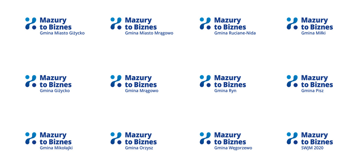
Each municipality has their own, local division.
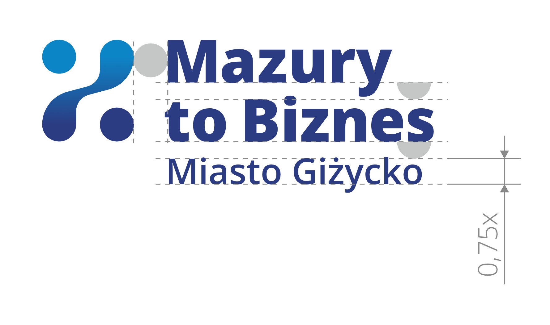

Clearly defined spacing rules.
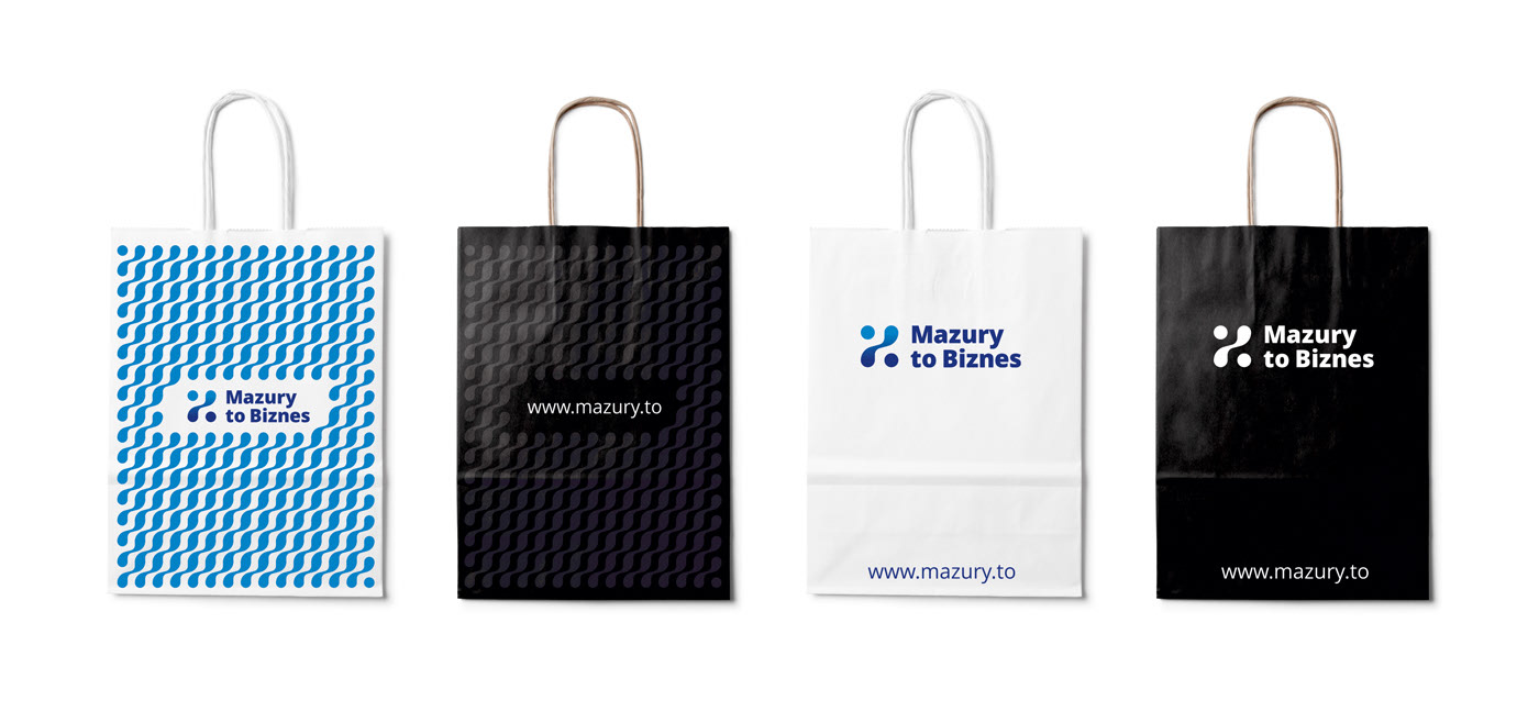
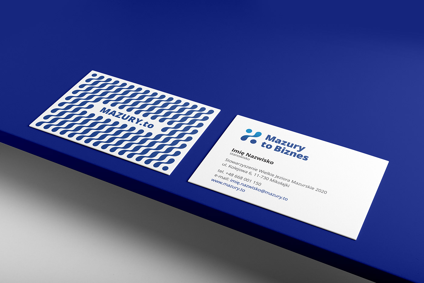
Pattern constructed from the logo's main element.
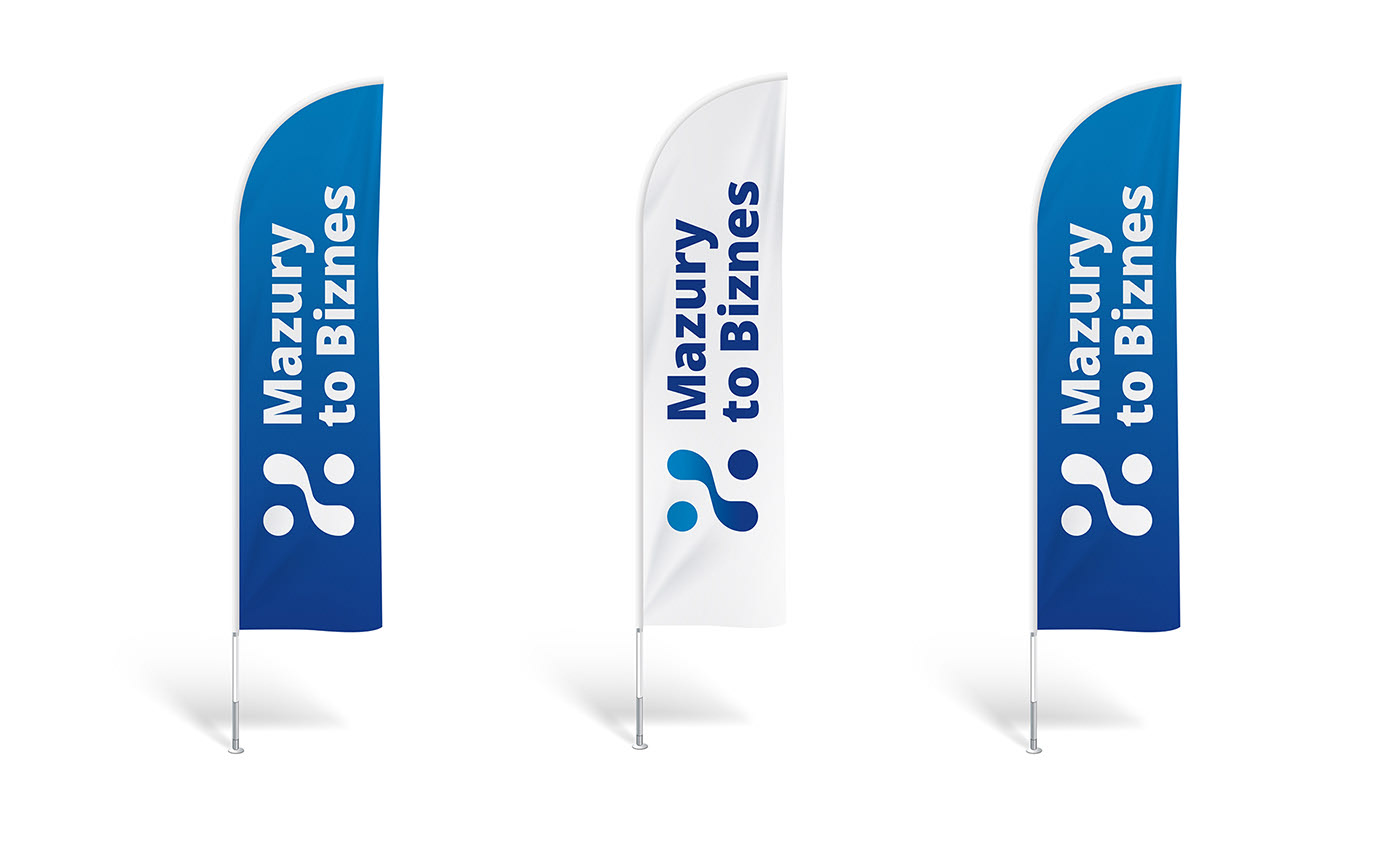
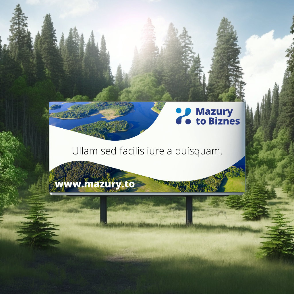
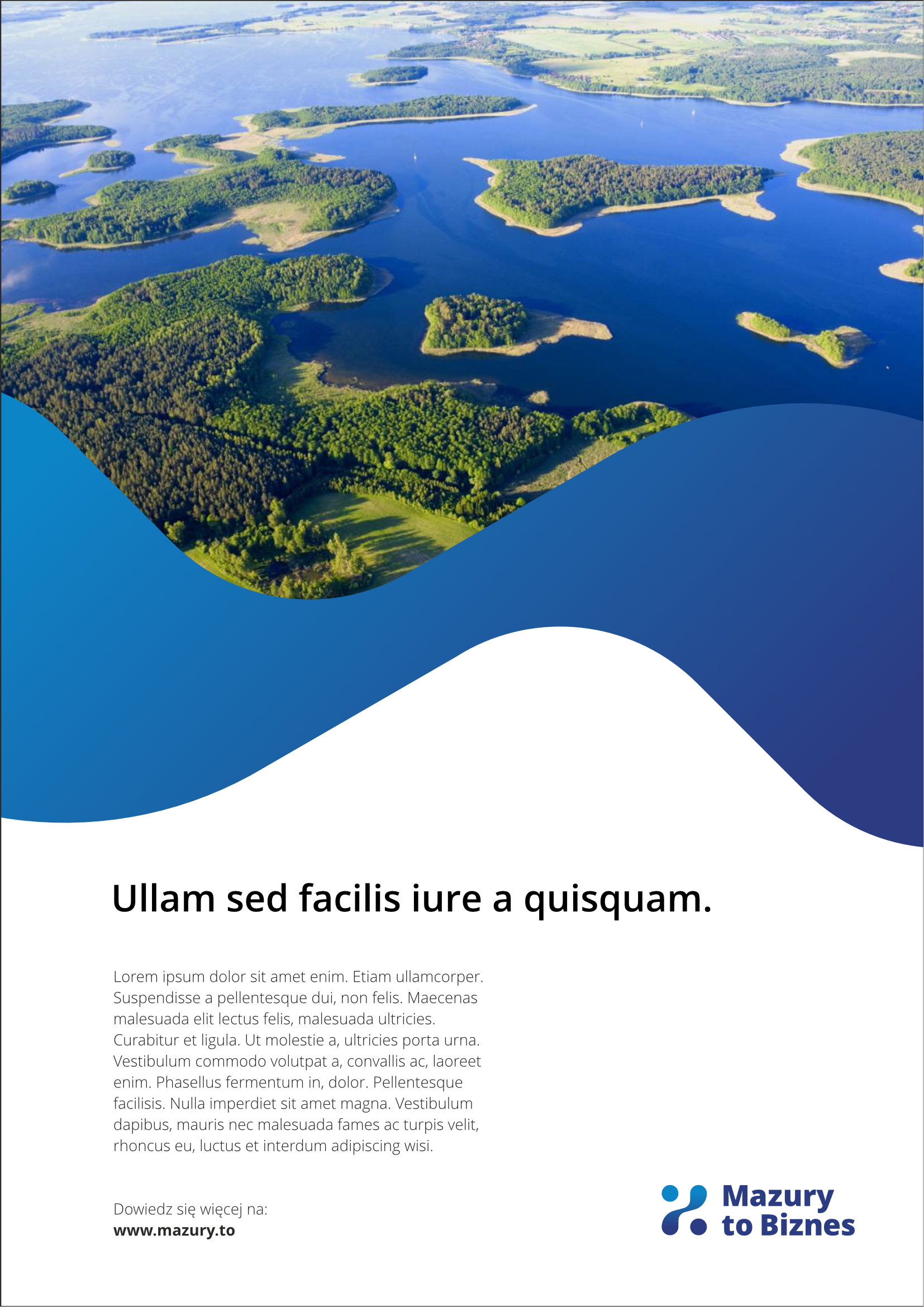
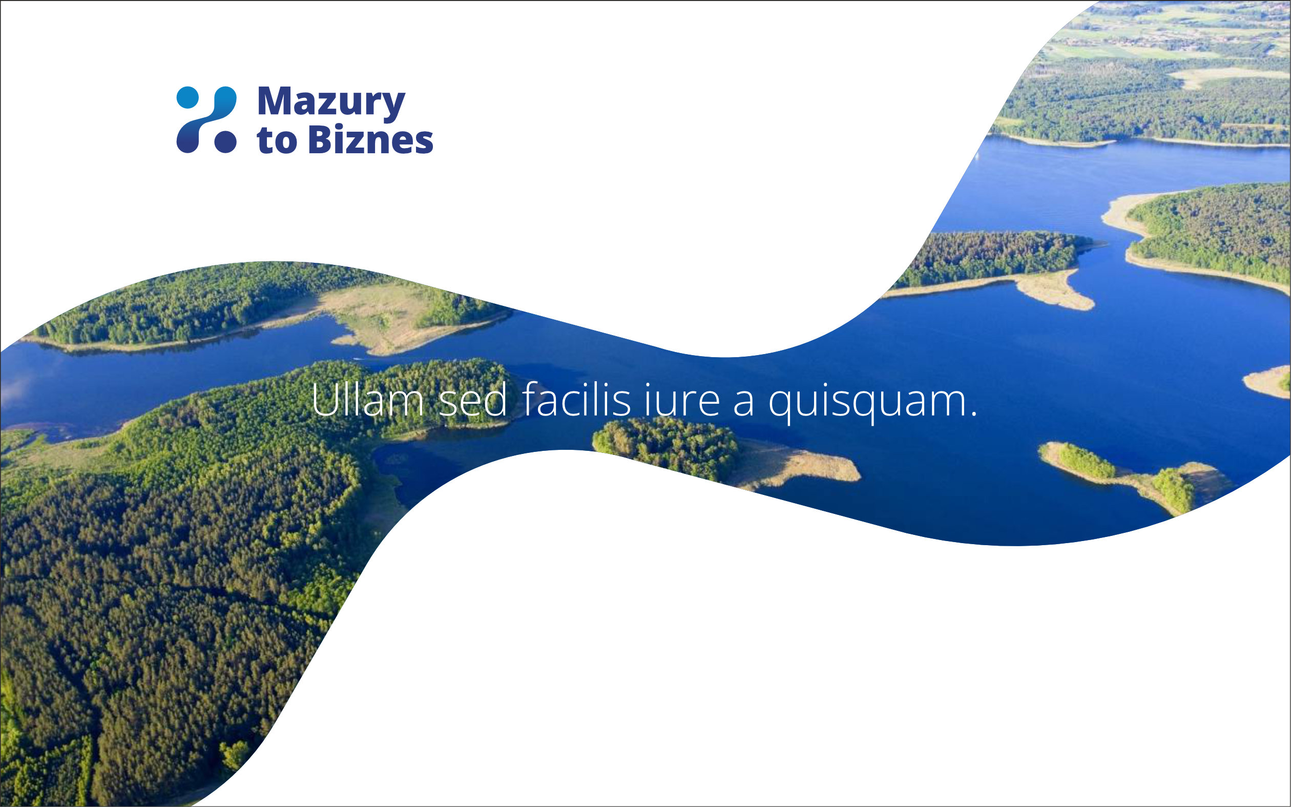
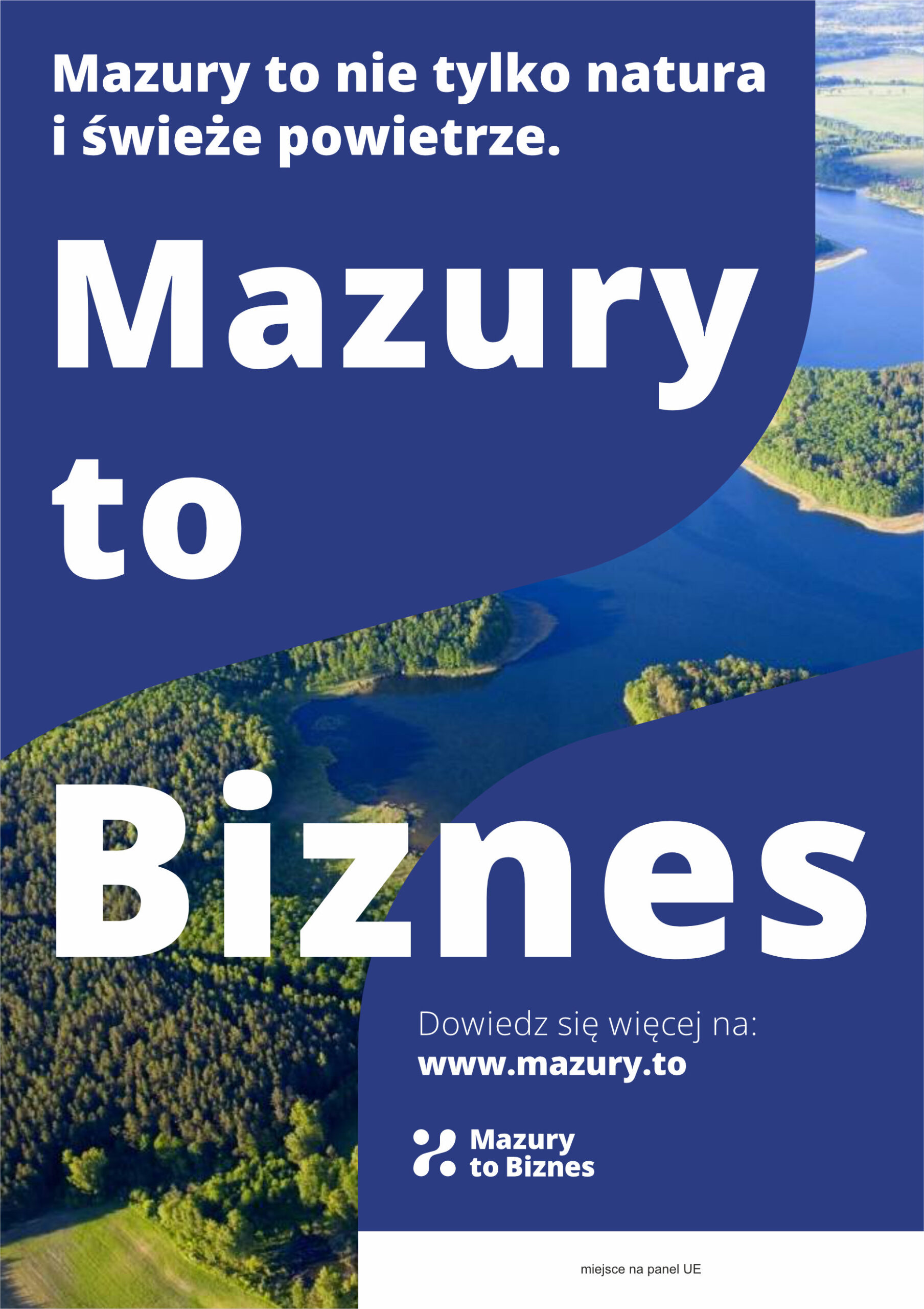
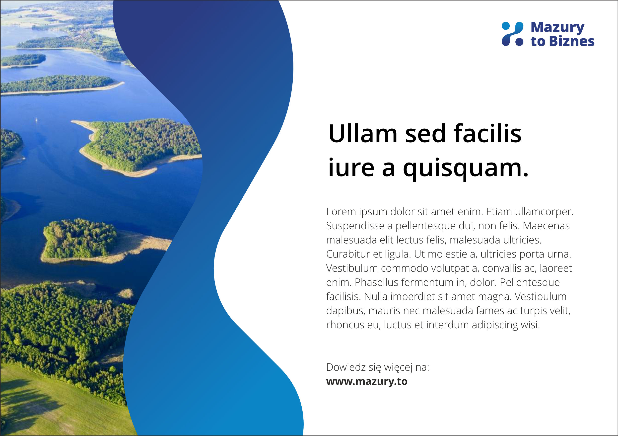
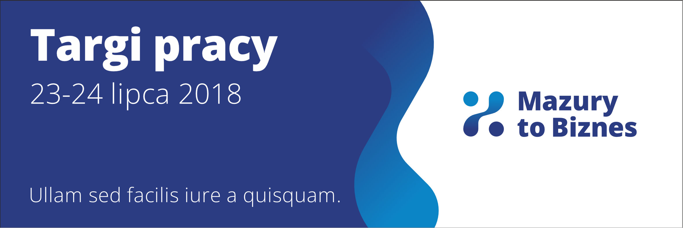

Billboards and banners using the main logo component as a divider or a window.
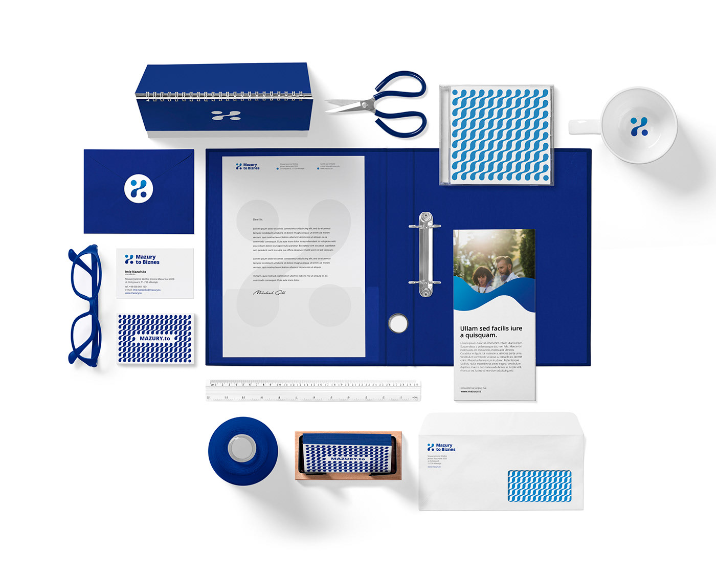
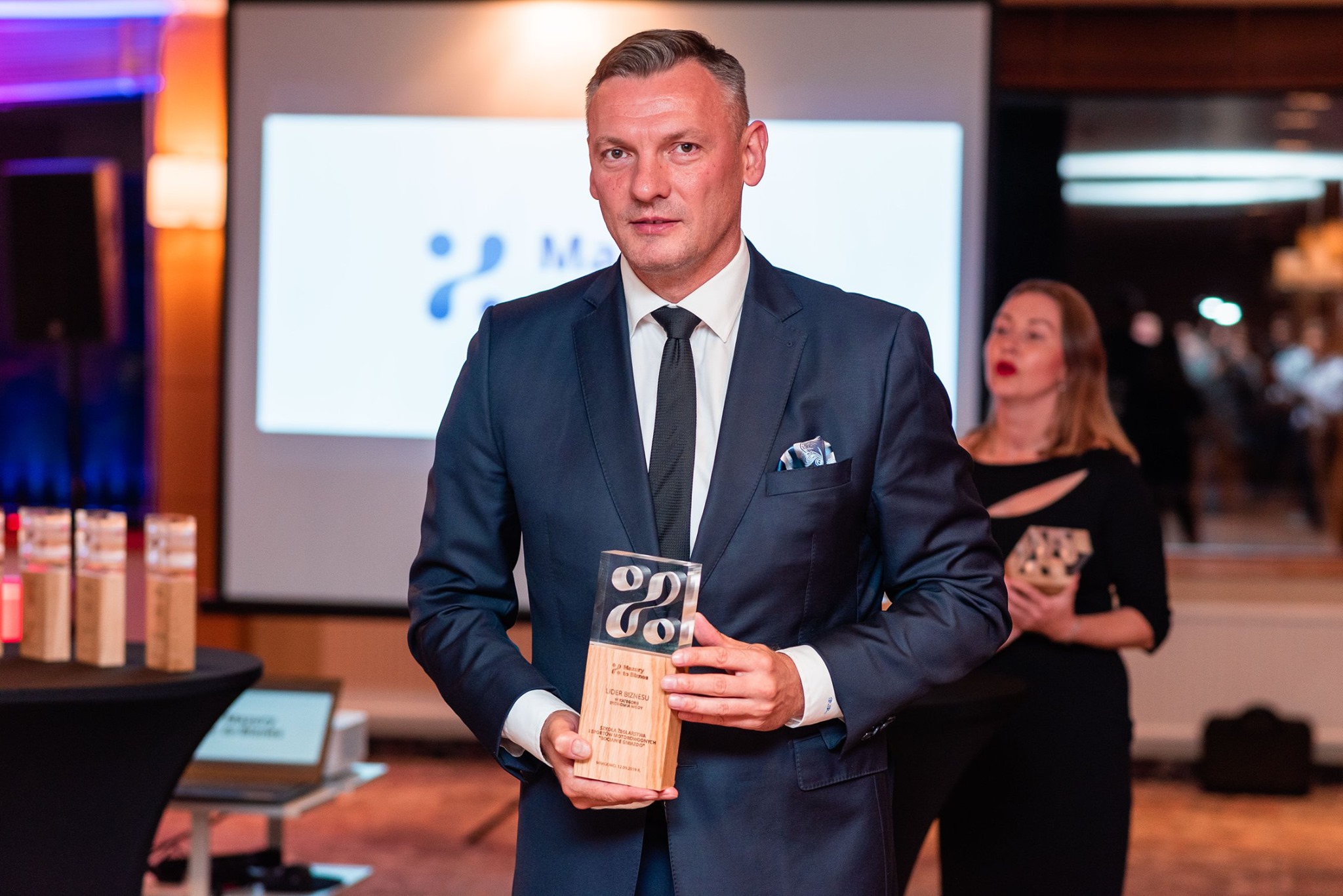
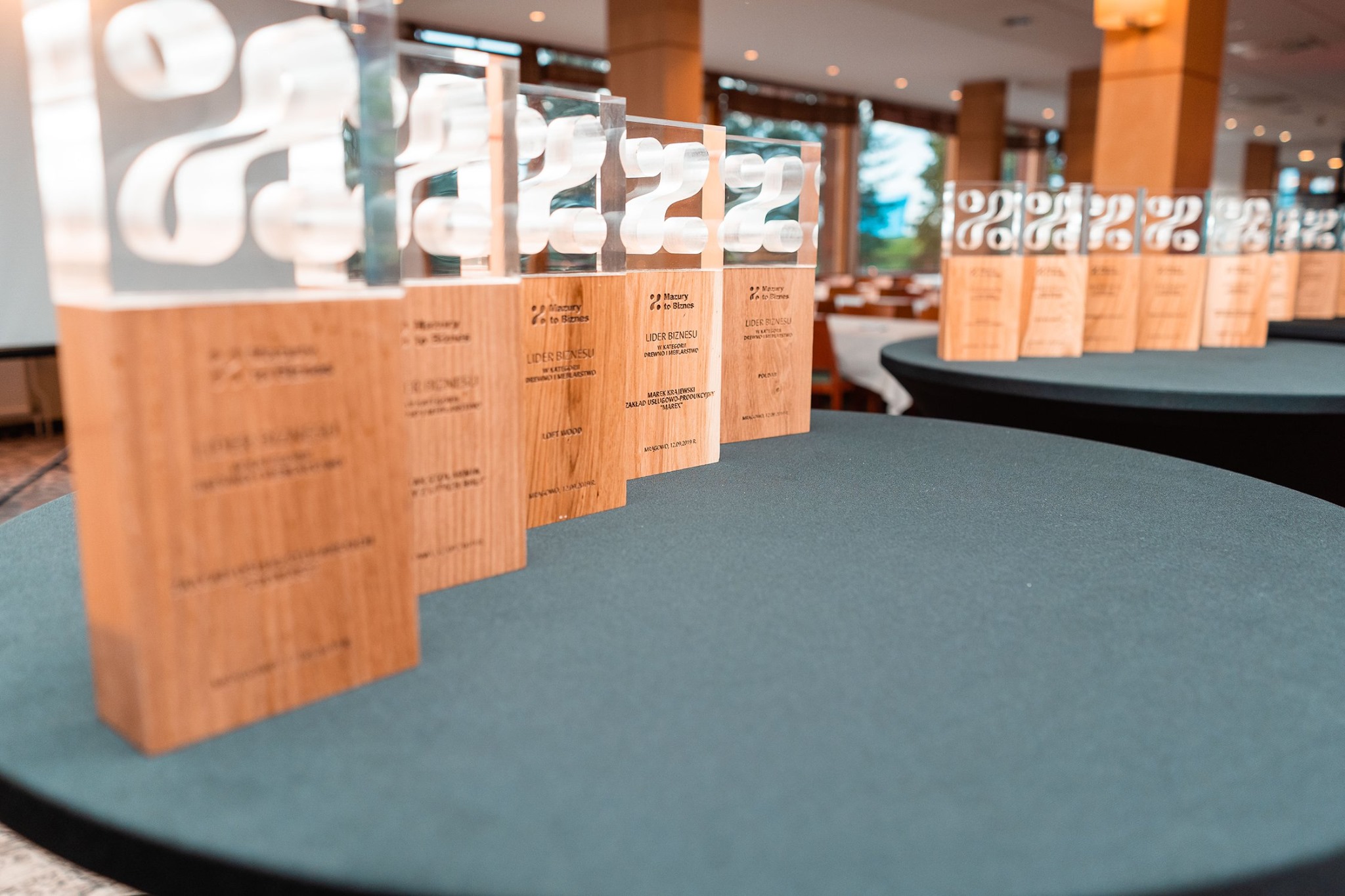
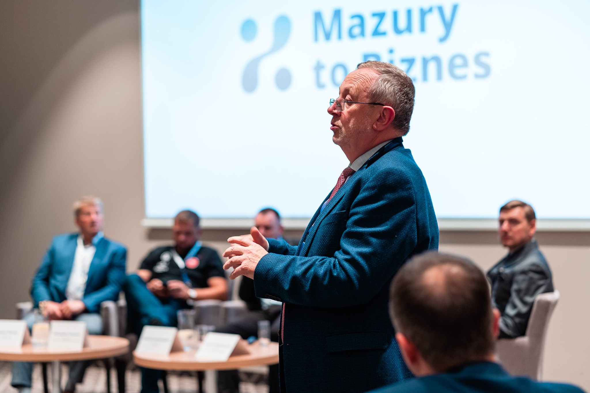
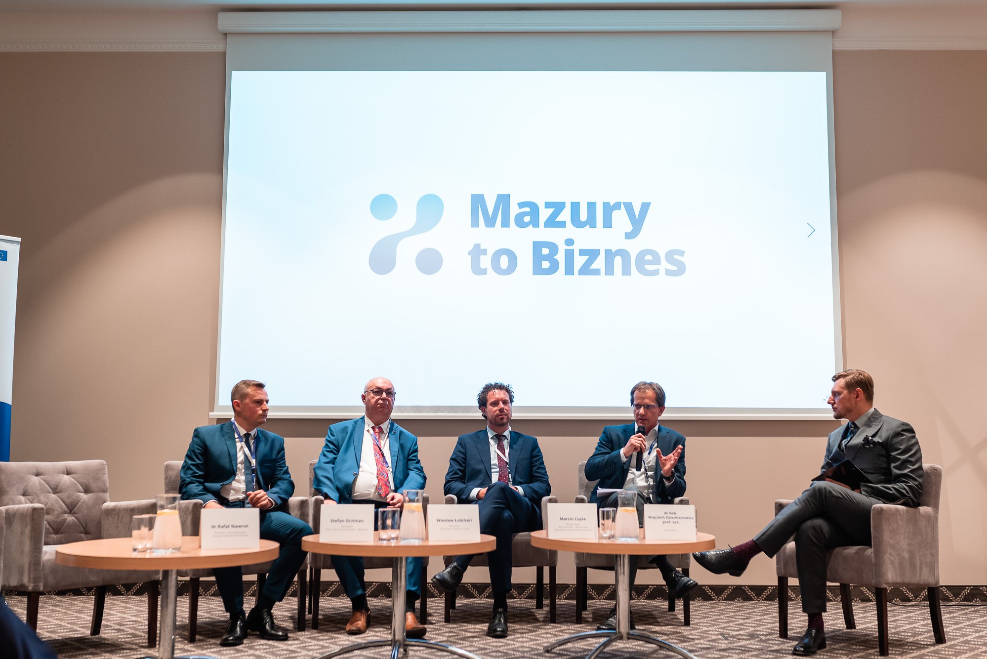
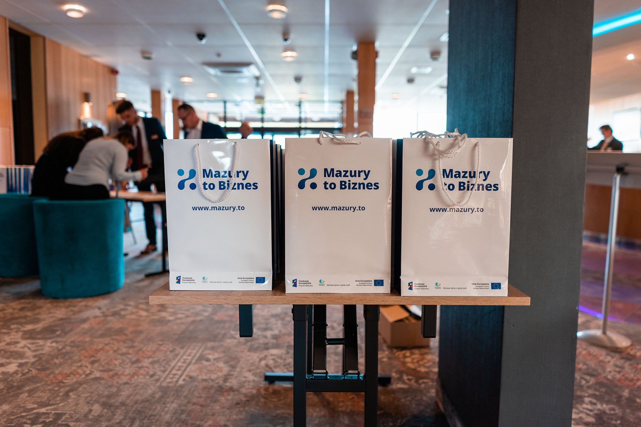
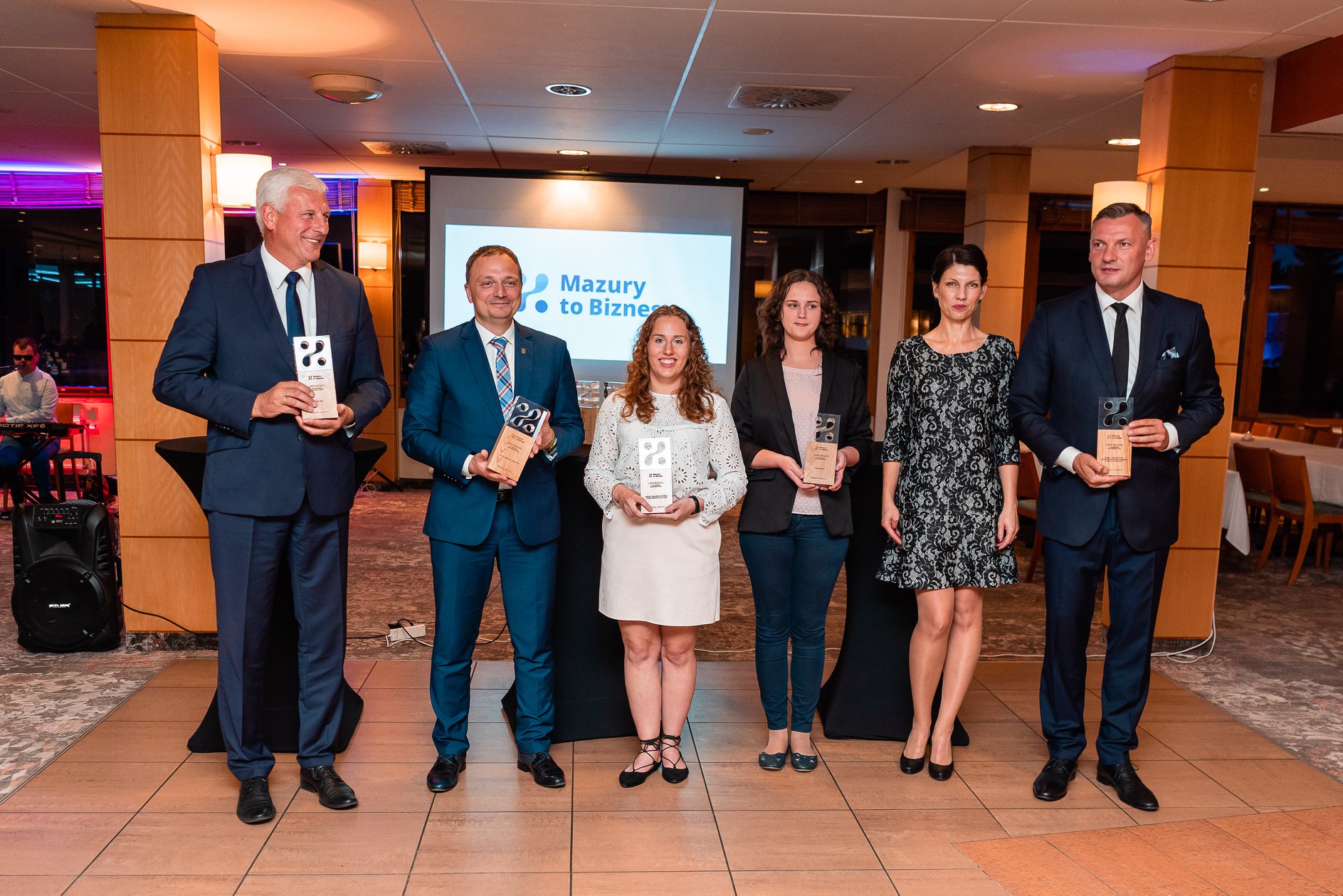
Photo credit: Stowarzyszenie Wielkie Jeziora Mazurskie 2020 / mazurytobiznes.pl
Selected Works
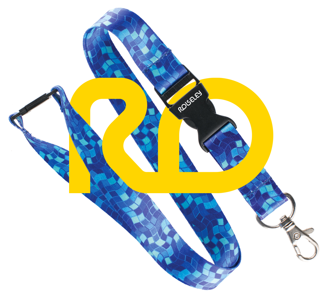
ROLSELEYNew visual identity for an e-commerce business
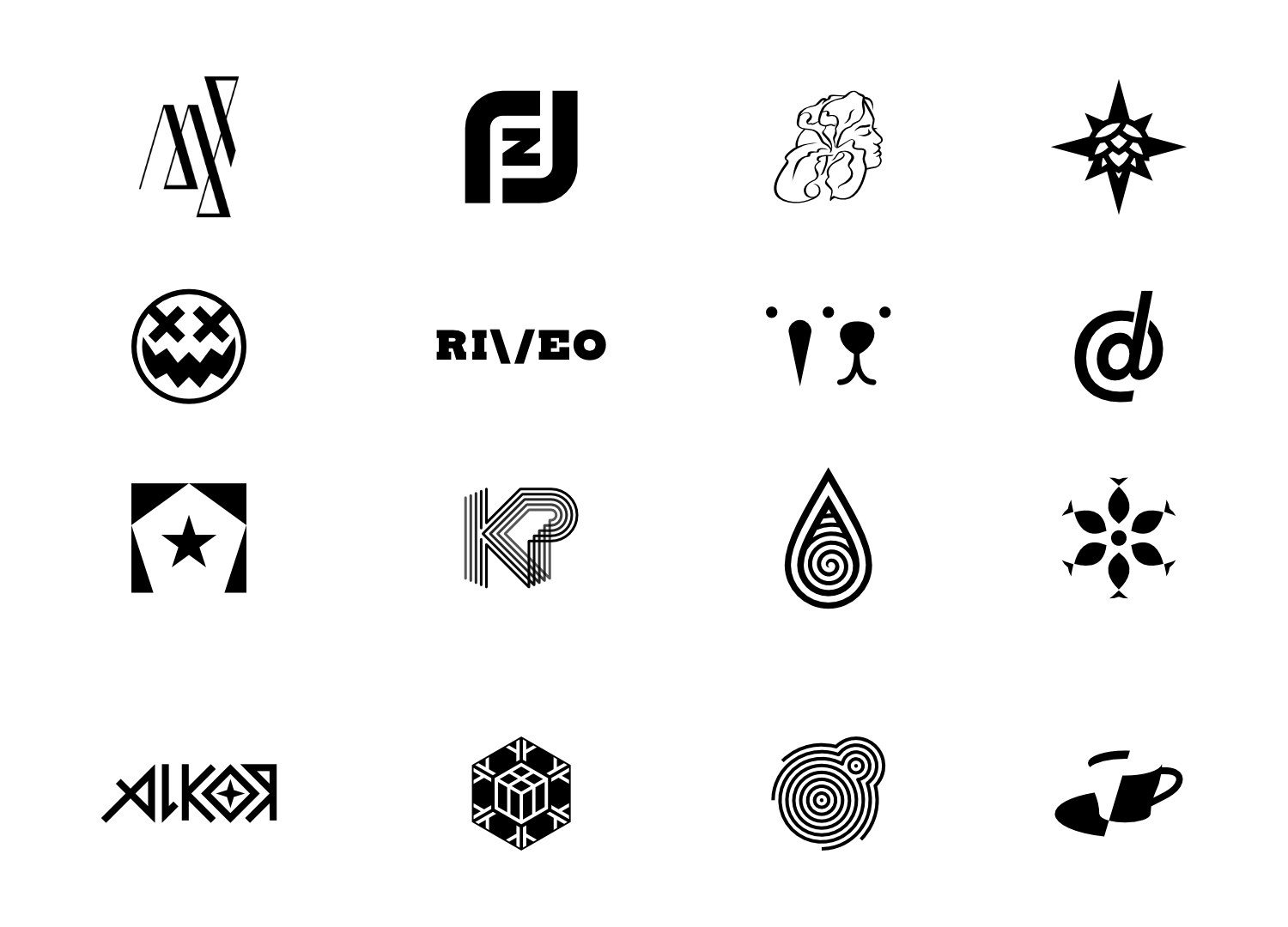
Selected logo projects2014 — 2023
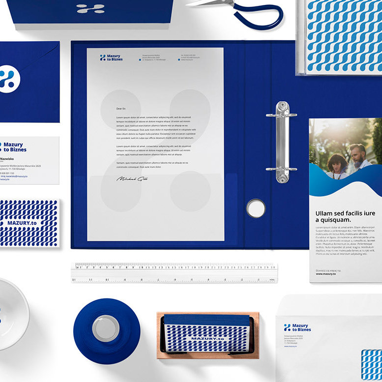
Mazury to BiznesVisual identity for local business support organization
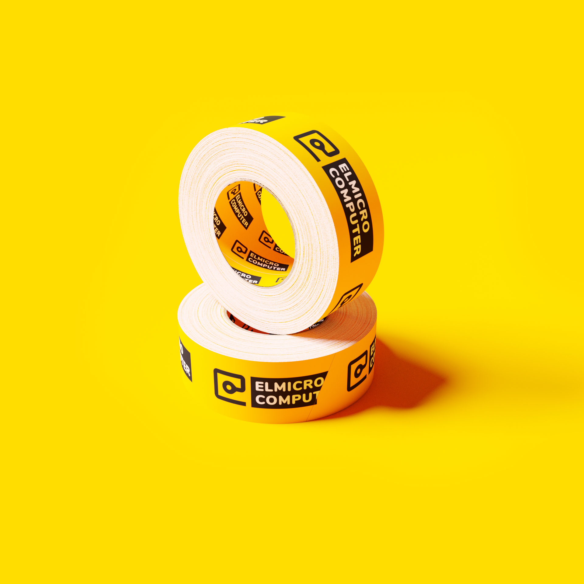
ELMICRO COMPUTERRebranding for an electronics store
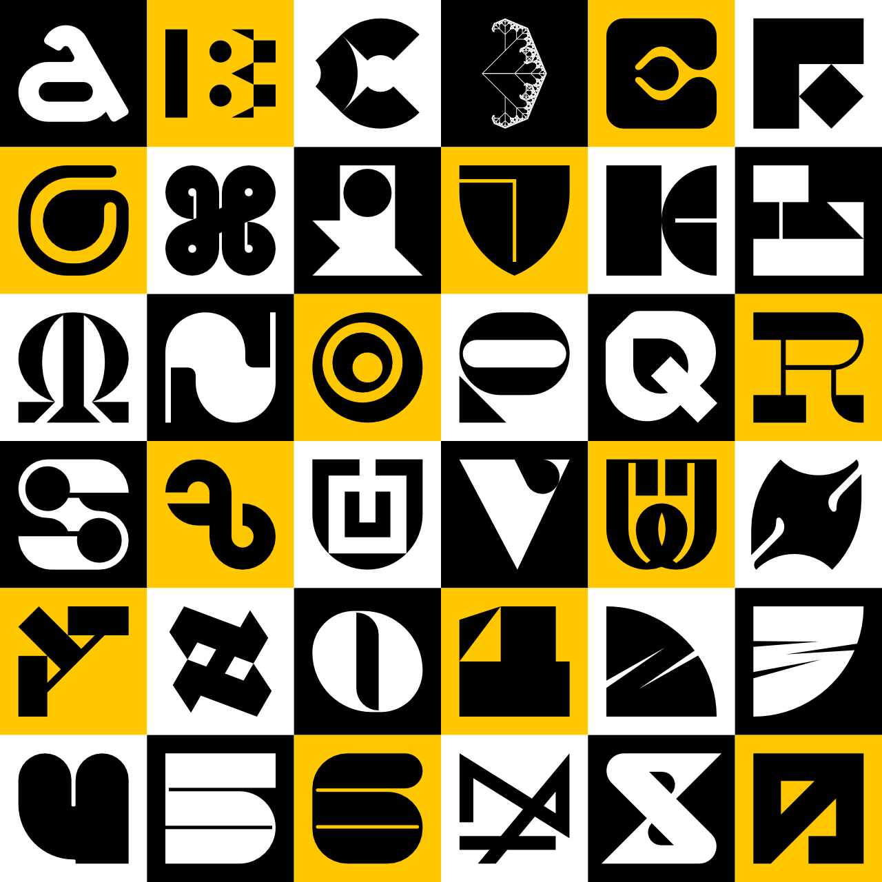
36 days of typeTypographic experiments