
Colour conversion shouldn’t be confused with file type conversion, even though file type conversion can cause a colour conversion too.
A colour conversion will not change the file type, but it might force you to save the file in a different file type. (Example: converting a .png file to CMYK means that you won’t be able to save it in the same format since .png doesn’t support CMYK).
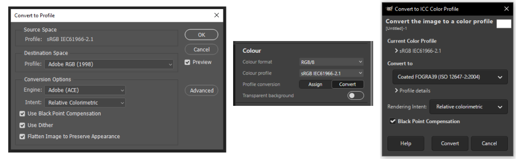
Most image editing programs allow the user to convert an image from one colour space to another. Converting an image, always modifies the colour values of all of the pixels in an image. It can also mean a few things:
- Changing the colour space, I.e. between RGB, CMYK, GRAYSCALE, LAB, etc.
- Changing the image to a different colour profile within the same colour space, I.e. sRGB to AdobeRGB
Possible side-effects of image conversion:
- Loss of pure colours (especially painful for black ink / text)
- Loss of detail
- Banding of gradients
Some of the above are mitigated by special device-link profiles.
What about Pantone and other spot colour systems?

You can easily convert an image with spot colours to CMYK or RGB, although the results may vary depending on the software. Spot colours usually have a preview value in either Lab, RGB or CMYK. Some RIP software have built-in spot colour libraries, which try to match the name of the spot colour in the document to the names of colours in its library. If there is a match, the preview values are ignored and the library values are used instead. These libraries can sometimes be edited, and new spot colours defined to create colour accurate prints.
While the conversion from a spot colour to a colour space (RGB, CMYK, etc) is fairly straightforward, the same cannot be said about the reverse direction. You cannot simply convert an image to Pantone colours. The colours need to be applied manually to selected parts of an image, using software that supports spot colours (Adobe Illustrator, InDesign, Affinity to name a few). Depending on the artwork’s complexity, this can be a very complex and time consuming process.

Colour photographs usually aren’t rendered in Pantones, but it’s possible to create monochrome images using your chosen spot colour. It’s also possible to combine 2 or more spot colours to create highly stylised duotone, tritone and multitone images.
Rendering intent
Converting from a smaller colour space to a larger one is pretty straightforward because all the colour information fits within the new colour gamut. Converting a large gamut into a smaller one is more complex. Some of the colours cannot be rendered in the smaller colour space - they exist outside the target colour gamut. The main two ways of dealing with this issue is either to squeeze the bigger space into the smaller one, or cut off anything that doesn’t fit. This is controlled by the selected Rendering Intent.
The selected rendering intent dictates how the colours are to be converted.
- Perceptual, Photographic,
- Relative Colorimetric
- Absolute Colorimetric
- Saturation
Others:
PosterColor (Onyx proprietary)
Do you know any others? - let me know in the comments!
Perceptual
Perceptual, also called Photographic maintains the relationships between the colours, by shrinking the whole colour gamut to fit into the target colour gamut. Often this is the default rendering intent. It’s recommended for photographic images where colour accuracy is less important than the overall look of the image. As the colours will shift from the original, it is not recommended for any situation where colour accuracy is desirable, i.e. brand colours. It is also considered the safe option in scenarios where you don’t have any control over the process and/or there is no proofing stage.
Relative Colorimetric
Relative Colorimetric rendering intent maintains the colour accuracy of the colours that are inside the target colour gamut and only shifts the colours that are outside of the gamut to the nearest achievable colour. The result of conversation depends on the image content - if there are any colours in the image that don’t fit in the target colour gamut, they will be rendered as flat colour and some image details may be lost. If the image doesn’t include saturated and vibrant colours, there is a good chance that it will be converted perfectly, without any colour shift. This rendering intent is best for brand colours and for workflows with a proofing stage.
Black point compensation
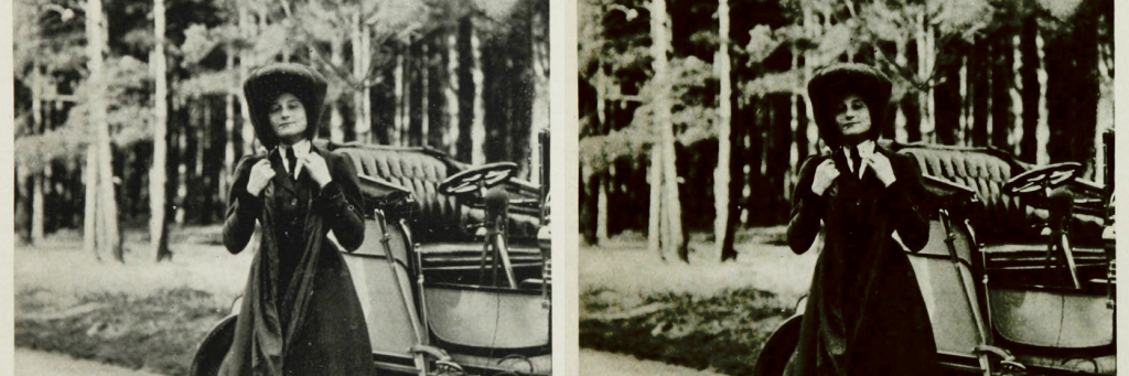
Is an optional setting for the Relative Colorimetric rendering intent. It causes the black point (darkest colour in a colour space), of the source colour space match the black point of the target colour space. In essence it does to the black point what Relative Colometric rendering intent does to the white point by default. This prevents the darkest colours from clipping when they’re outside of the colour gamut of the target colour space.
When the darkest colours are clipped, instead of seeing details, and gradual transitions in the shadows, we see a solid black patch. See example below:
Absolute Colorimetric
Absolute Colorimetric rendering intent is similar to relative colorimetric with the difference that the white point isn’t assigned to the target gamut white point. In other words, if the white point of the original colour gamut is different than the target, then this will be reflected in the resulting image. In normal circumstances this isn’t something you would desire. The main purpose of Absolute Colorimetric rendering intent is proofing. It allows to simulate the colour of the paper on a proof, thus rendering the image closer to how it will appear in print.
Saturation
Saturation rendering intent forces all the colours to their most saturated counterparts in the target colour gamut. This is useful for printing graphs. Personally, I never had a good reason to use this rendering intent. Let me know if it’s part of your workflow!
Other
Other rendering intents exist, usually proprietary, part of a software package, like a RIP. One I have had some experience with is called PosterColor. It's a rendering intent available in Onyx RIP software.
Colour management engine
Some graphic editing software allows you to choose the Colour management engine, which basically is the algorithm that is used to convert the colours. Different engine = different implementation designed to perform the same function. They do produce slightly different results, so the choice is not without consequence.
Options include:
- Adobe (ACE) - Adobe Color Engine
- Apple - ColorSync
- Microsoft ICM
- LittleCMS
If you're using Adobe software, the choice is simple - "Adobe (ACE)" Adobe Colour Engine, is an industry standard. I don't think there's a valid reason to be using another CMM instead of it. Disagree?
Summary
I hope I made you realise that there's more to converting colours than meets the eye. With greater understanding of what is going on in the background we can avoid (sometimes costly) mistakes and disappointments. If you would like to learn more about some aspects of colour conversion - let me know in the comments!
No Comments.